CLIENT
Melrose Health
SERVICES
Brand & Web design
DATE & YEAR
18 Sept 2020
Background
Melrose Health is a trusted Australian wellness brand with a legacy dating back to 1979. As the company continued to grow, there was a need to elevate its digital presence and product branding to reflect its evolving values around natural health, quality ingredients, and innovation. I partnered with Melrose to deliver a refreshed website experience and updated branding labels across product lines, aligning their digital and physical touchpoints.
Challenge
The key challenge was to modernise the Melrose brand without losing its authenticity and connection to long-time customers. The website needed to better reflect the brand’s purpose and support a growing e-commerce offering, while catering to a health-conscious, digitally-savvy audience. From a UX perspective, this meant simplifying navigation, improving content hierarchy, and enhancing the mobile experience. On the packaging side, it was essential to create labels that stood out on shelves while staying true to the brand’s heritage.
Solution
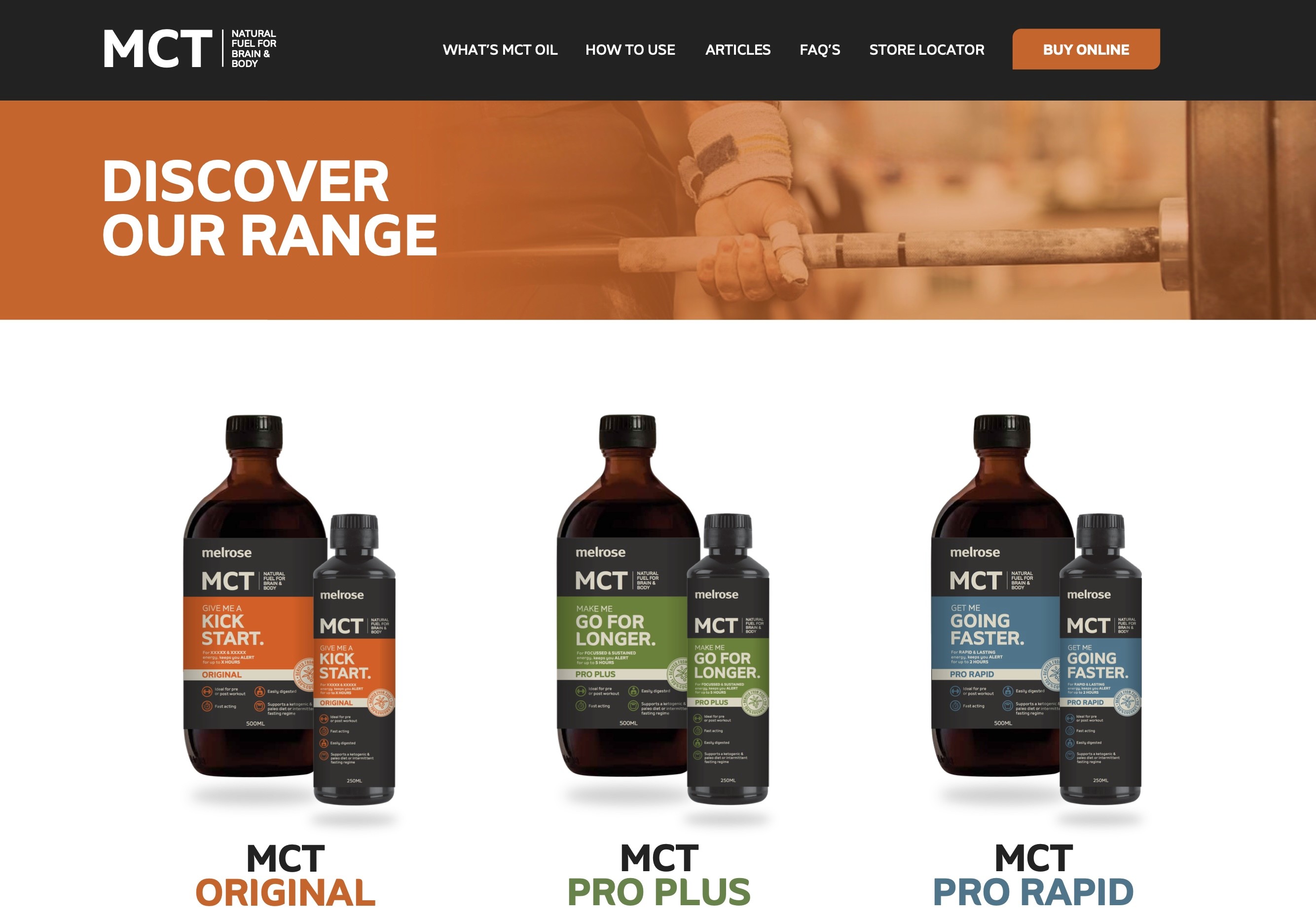
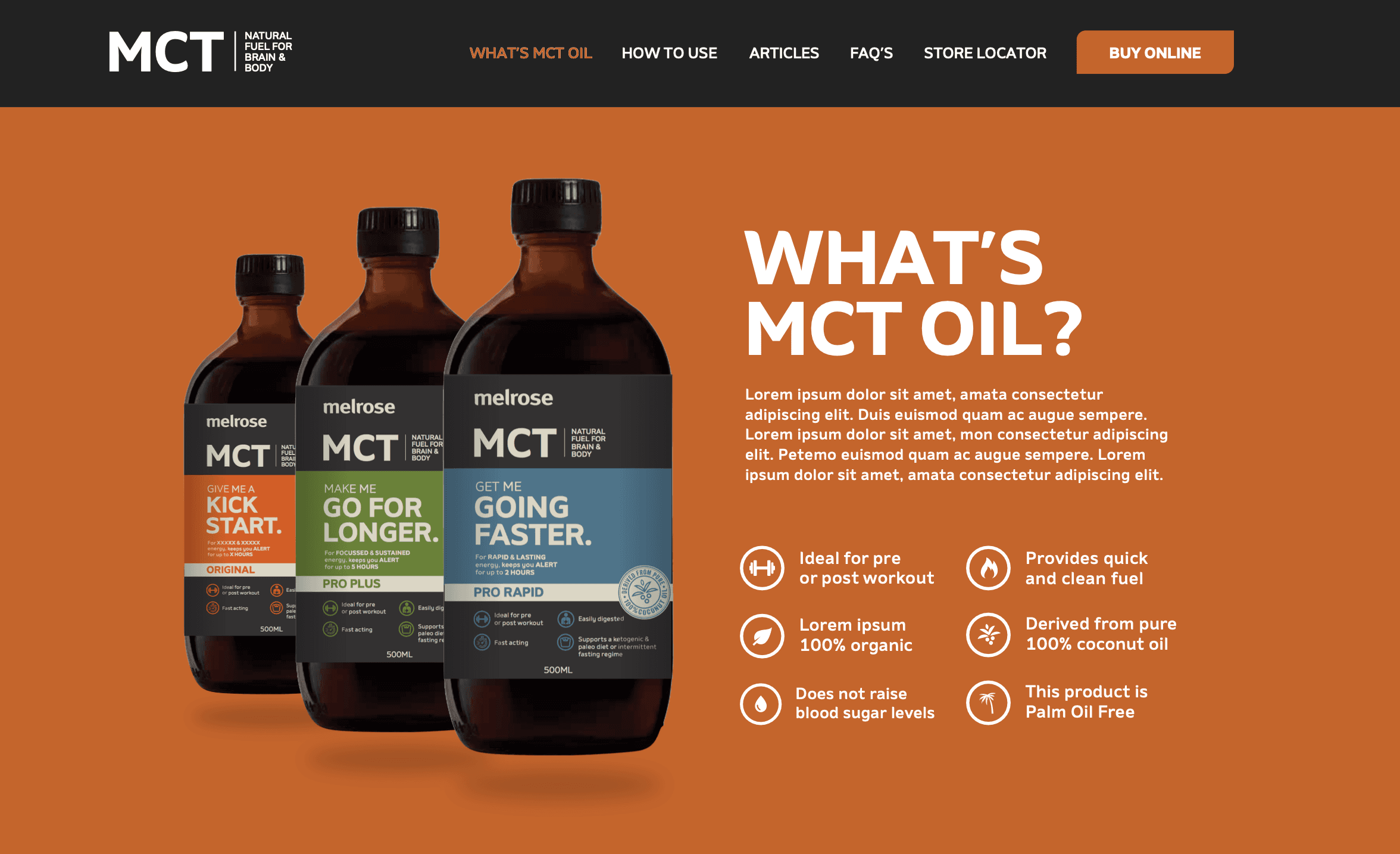
I led the UX and UI design of the new website, starting with user research and competitor analysis to define customer needs and behaviours. This resulted in a clean, intuitive interface focused on easy product discovery, educational content, and seamless e-commerce flows. I also developed a refreshed visual design system using earthy tones, clean typography, and consistent iconography that echoed the brand’s natural and transparent ethos.
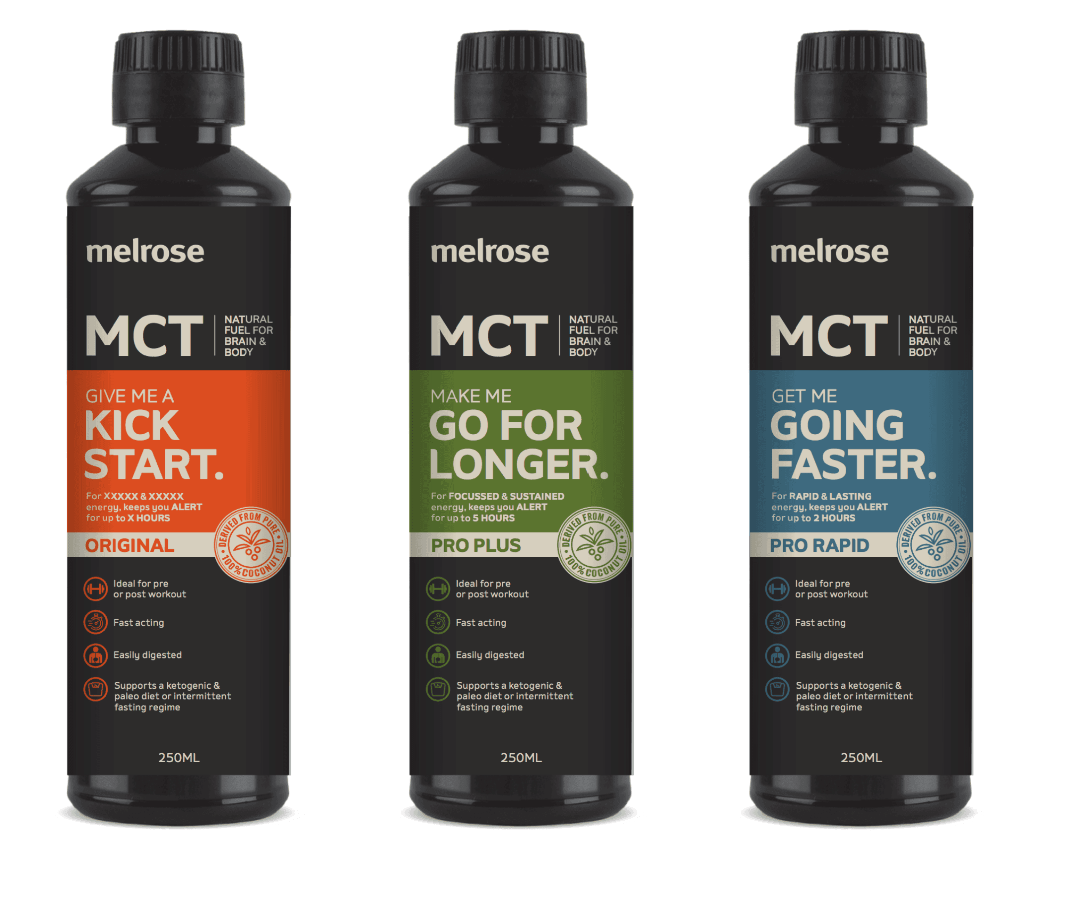
Alongside the digital experience, I designed a suite of product labels with a modern, minimalist aesthetic that clearly communicated health benefits and ingredients. The result was a unified brand experience, both online and in-store – that resonated with existing customers and attracted a new generation of wellness enthusiasts.
Process
The project began with stakeholder interviews and a UX audit of the existing site to identify usability issues and content gaps. I then mapped out key user journeys across both B2C and B2B flows, ensuring the new experience supported diverse customer needs from quick product purchases to in-depth ingredient research.
Wireframes were developed and tested with a small group of target users to validate layout, navigation, and information hierarchy. This allowed us to iterate quickly and address friction points early in the design process.
Once the UX foundation was solid, I transitioned into UI design, creating a modular design system that could scale across new product lines and future campaigns. Accessibility and mobile responsiveness were built into every design decision. In parallel, I worked closely with the marketing and packaging teams to align the new product labels with the broader visual identity, ensuring consistency across touchpoints.
I collaborated closely with developers to support a smooth handover and build, providing detailed design specs and interaction guidelines.
Results
A 30% increase in online engagement within the first three months post-launch, driven by improved usability and clearer product pathways
Streamlined navigation and content structure reduced bounce rates by 22%
Positive feedback from both customers and internal stakeholders on the refreshed brand identity and improved site experience
Enhanced brand consistency across digital and physical products, reinforcing customer trust and product recognition
A future-ready design system that can grow with the brand and support new health product launches