CLIENT
AskYourTeam Survey platform
SERVICES
UX/UI design
DATE & YEAR
1 Dec 2022
Background
AskYourTeam is a New Zealand-based platform designed to surface the voices of employees, patients, and citizens through data-driven surveys that inform better leadership and organisational outcomes. With growing demand across sectors – from enterprise to healthcare and government – the product needed to evolve from a simple survey engine into a comprehensive engagement and reporting ecosystem.
I led the UX design of AskYourTeam’s next-generation platform, spanning the end-to-end survey lifecycle: from survey creation and participant experience, through to deep reporting and insights. This included major projects like the Employee Voice, Patient Voice, and Taxpayer Voice offerings – each with unique privacy, accessibility, and data interpretation challenges.
Challenge
AskYourTeam’s original platform had strong backend logic but was falling short on usability, flexibility, and clarity. Admins struggled to create and manage complex surveys across different cohorts. Survey takers found the experience impersonal, repetitive, and sometimes confusing. The reporting was rich in data but lacked structure, narrative, and visual digestibility.
Our design challenge was threefold:
Simplify complexity – empower admins with a flexible yet intuitive survey creation and management experience.
Humanise the survey journey – make survey-taking feel clear, respectful, and inclusive, especially when gathering sensitive feedback.
Elevate reporting – create a suite of dynamic reports (e.g. blindspot, benchmarking, question-type, comment analysis using NLP) that translated raw data into meaningful, actionable insights.
Solution
I spearheaded the design of a modular, scalable UX framework to support survey design, engagement, and analysis across different audiences and use cases.
On the admin side, we introduced an intelligent survey builder with templating, cohort management, conditional logic, and automated scheduling. A clean dashboard experience allowed users to track participation and campaign status in real time.
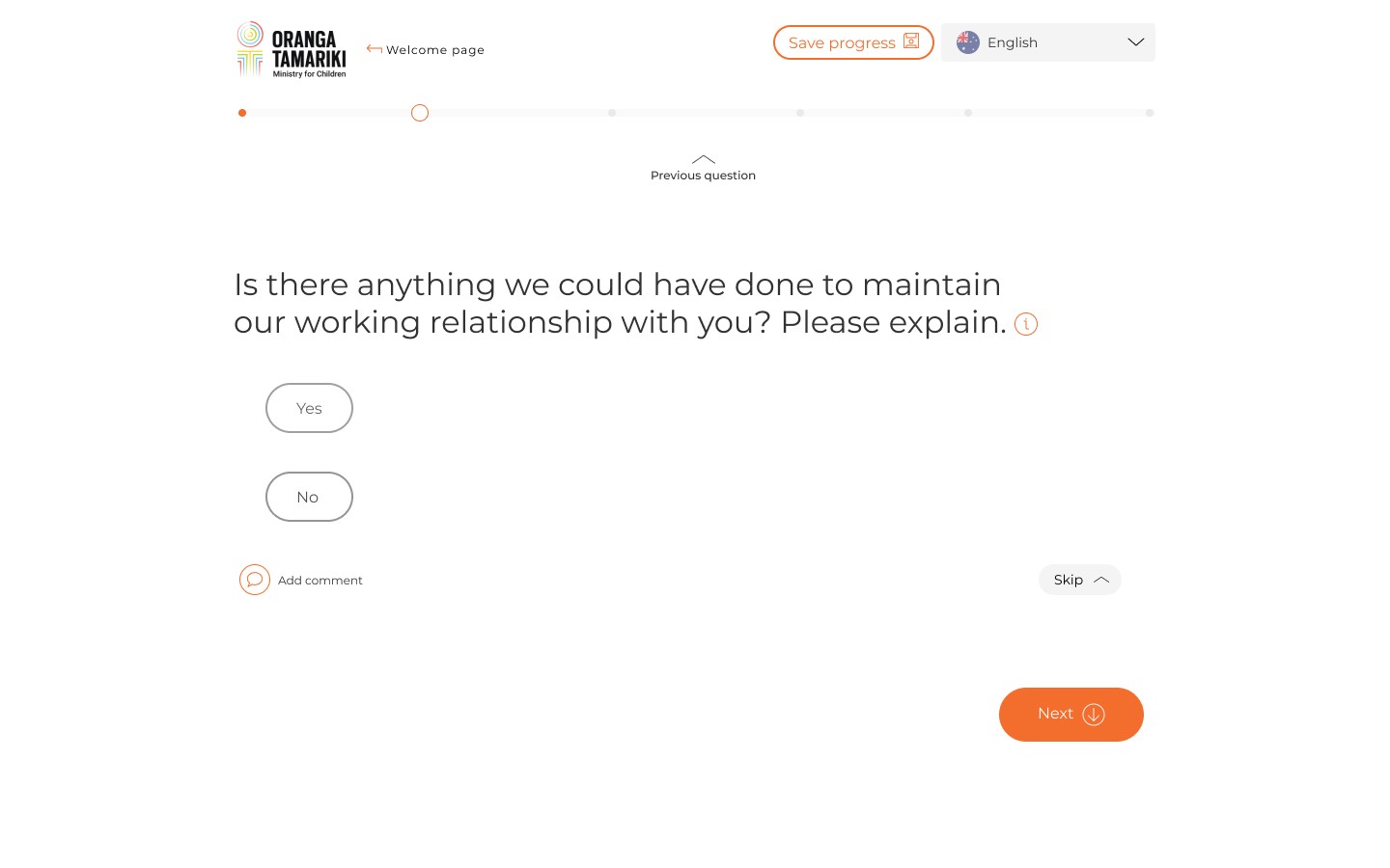
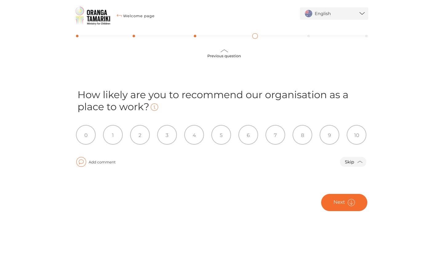
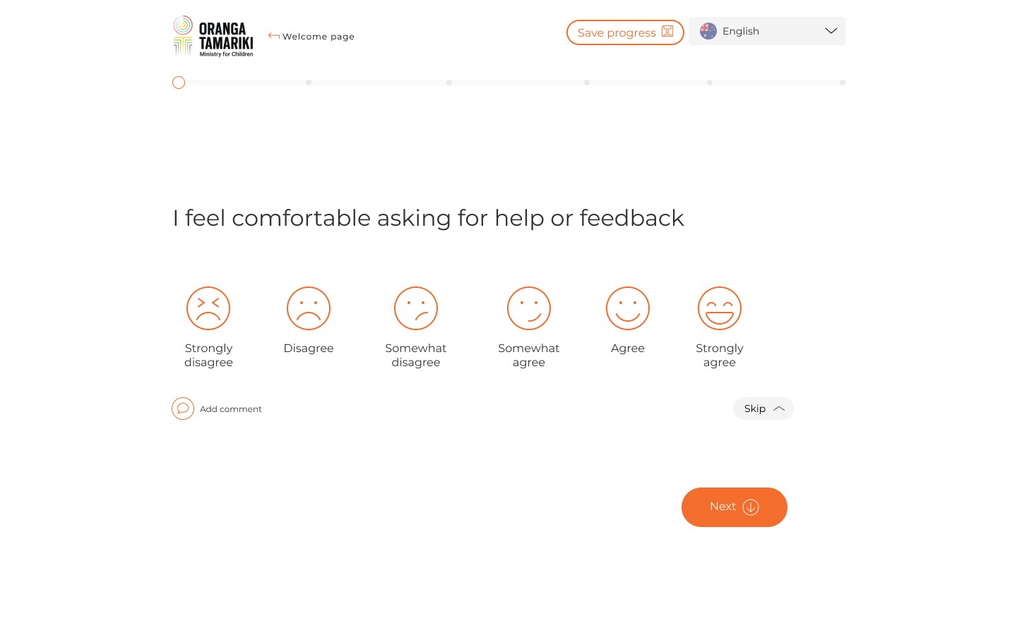
For survey takers, we crafted a friendly, mobile-first interface with improved language, progress feedback, and accessibility. We applied subtle personalisation cues to build trust and ensured data collection aligned with ethical design principles – especially in the Patient and Taxpayer experiences.
The reporting suite was completely reimagined. We designed a robust set of interactive reports, including:
Blindspot analysis to reveal perception gaps between leadership and staff
Benchmarking to compare internal and industry performance
Question-type reports for granular response patterns
Natural Language Processing (NLP)-powered comment analysis with sentiment trends and themes
These were supported by contextual filters, storytelling patterns, and export-friendly layouts to support various stakeholder needs.
Process
The project kicked off with discovery workshops across internal teams, enterprise clients, healthcare providers, and local government partners. I facilitated co-design sessions and led end-user testing with both admins and survey respondents to uncover friction and expectations.
We mapped out journeys across roles and touchpoints, and prototyped core flows: survey creation, survey taking, and report interpretation. I developed a cross-platform design system to unify interaction patterns, components, and branding across modules. Accessibility standards (WCAG 2.1) were incorporated from the outset.
I collaborated with data scientists to shape the NLP comment analysis module and partnered with engineers to optimise performance for large datasets. I also introduced design QA and continuous feedback loops across development sprints.
Process
Streamlined admin workflows reduced survey setup time by 40%
Over 200% increase in time spent in-platform – a sign of greater engagement and trust in the data
78% drop in data exports, with users increasingly relying on in-app visualisations and insights
Positive qualitative feedback from enterprise, government, and health clients citing improved usability and clarity
A flexible product architecture that now powers multiple verticals (Employee Voice, Patient Voice, Taxpayer Voice) with consistent UX and brand identity
A scalable design system that supports ongoing feature expansion and partner integration